BRAND GUIDE
Hello and thank you for your interest in RockTape. We made this site easy to use and always up-to-date with the latest assets and information about RockTape’s brand. We have a few simple guidelines for using our brand assets, please review carefully.
-Michael Sierra
Creative and Brand Manager
RockTape, Inc.
Do
- When typing out RockTape, make sure it is one word with a capital T.
Don’t
- Alter our logo in anyway (color or shape).
Logos
Color

RockTape Red
PANTONE: 186C
RGB: 200 16 46
HEX: C8102E
CMYK: 2 100 85 6

RockTape Black
RGB: 17 17 17
HEX: 111111
CMYK: 0 0 0 100

RockTape White
RGB: 255 255 255
HEX: FFFFFF
CMYK: 0 0 0 0
Type
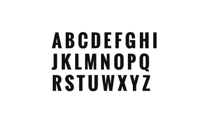
Oswald
Our typeface for headlines. Usually set in all uppercase. Use when you want to make a bold, short statement.
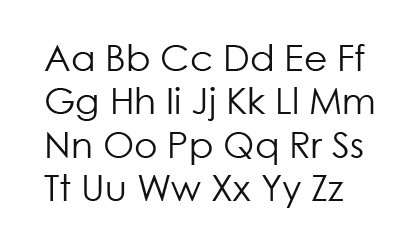
Century Gothic
Our typeface for body copy. Use when you have more to say. Only set in sentence case (not in all uppercase), to provide the most legibility.
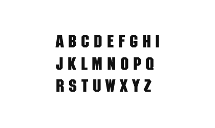
Machine ITC TT
Our logo typeface, use sparingly. Reserved for product and product family names.